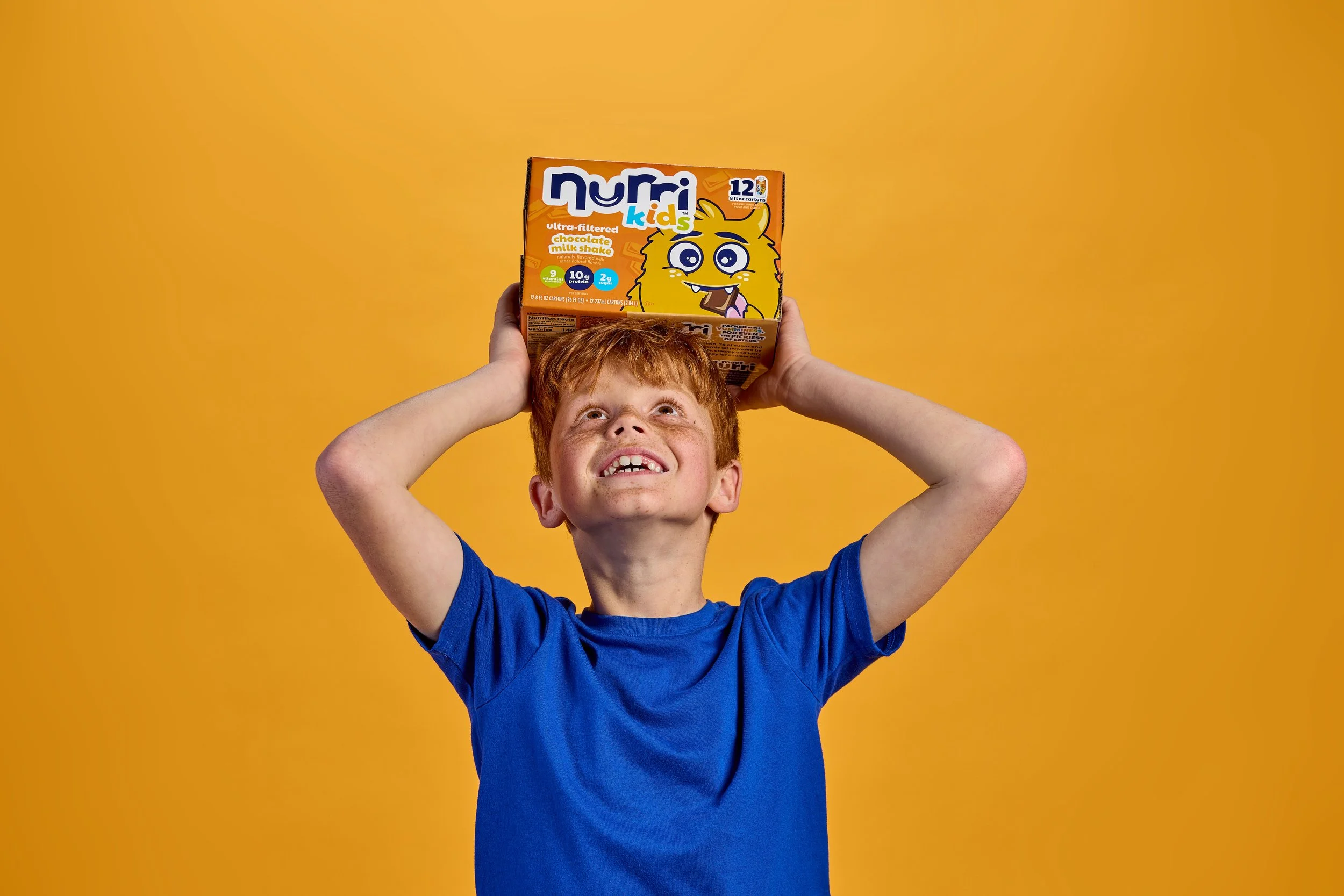
The identity system was built to work across packaging, digital, and any future extensions the brand grows into. To keep in line with its parent brand the Nurri Kids logo acts as its own entity with the adaption of “Kids” underneath it.
Client work

Nurri
Overview
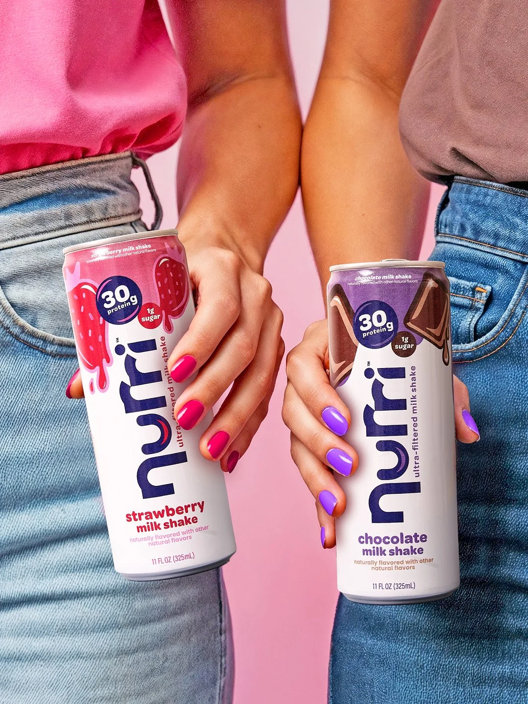
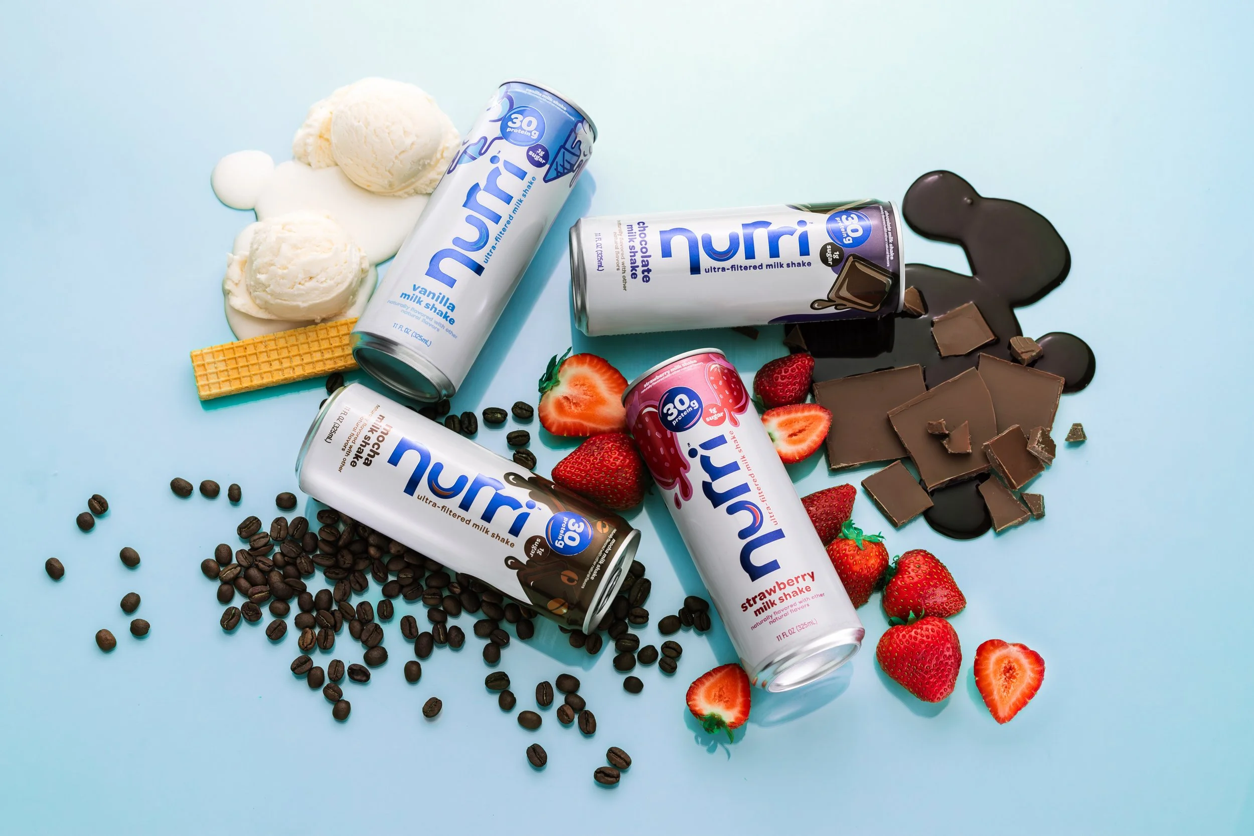
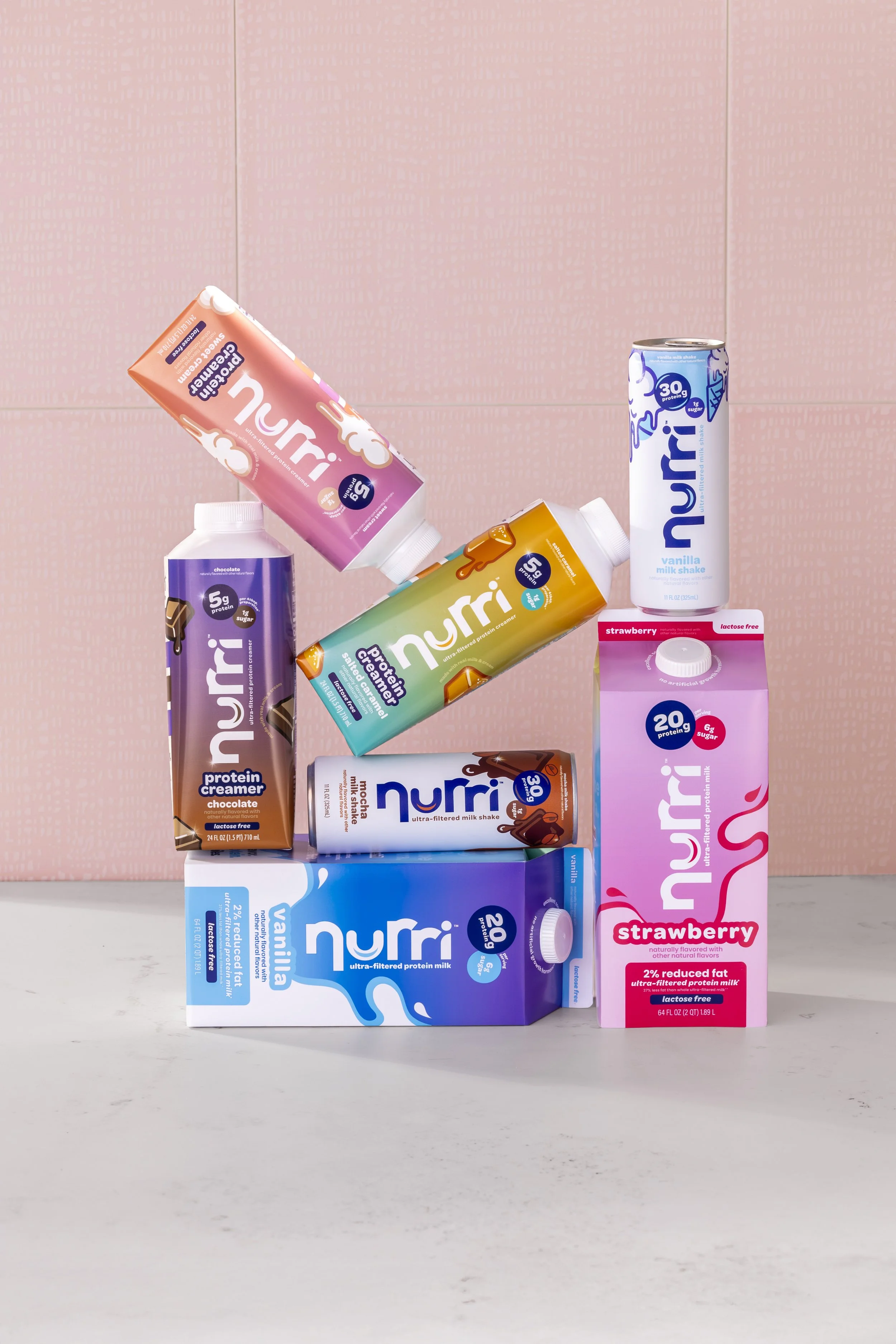
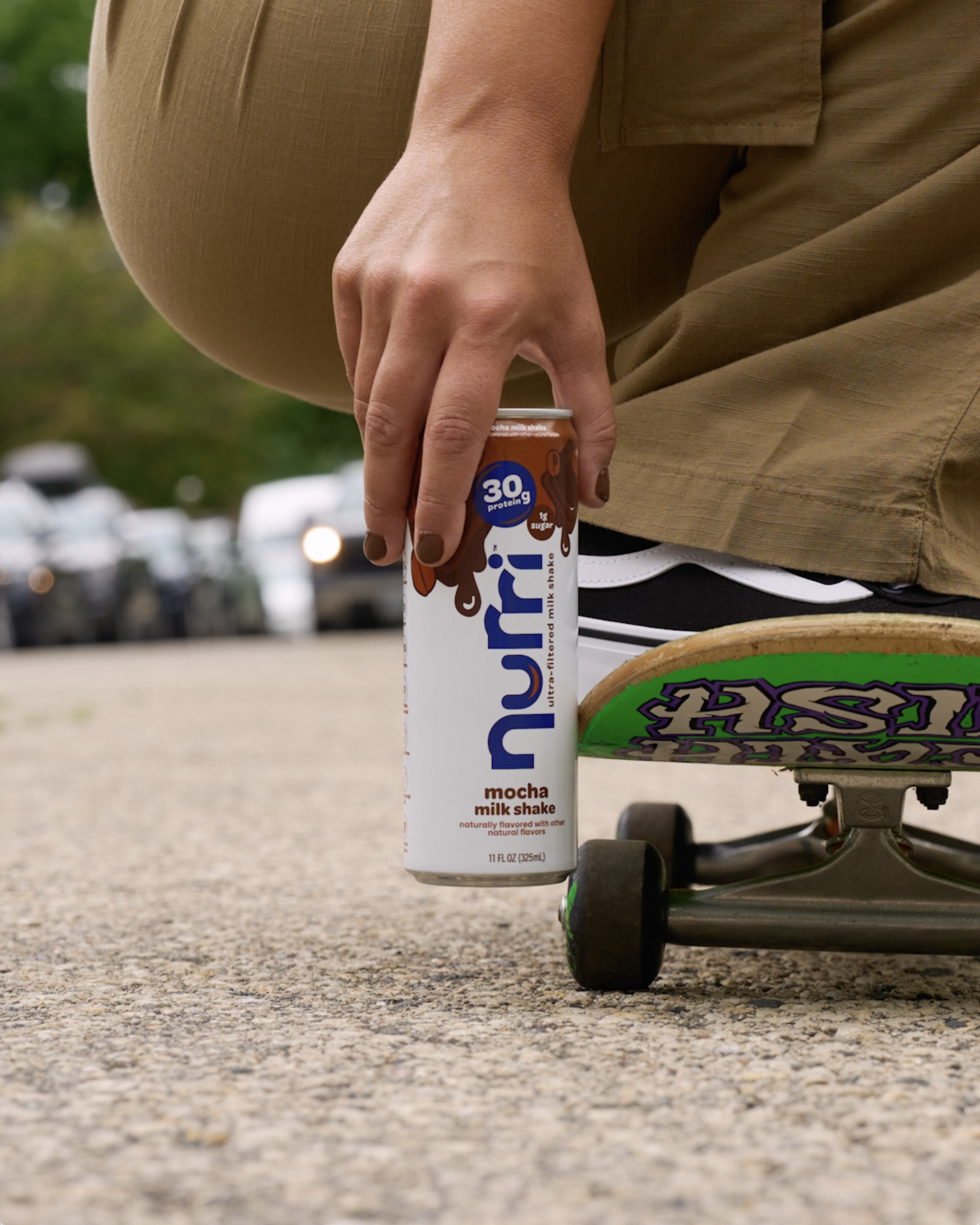
Nurri started as an ultra-filtered milk shake with a bold refresh problem: stand out in a saturated functional beverage category without losing the approachable, playful personality that makes the brand different. What began as a packaging and campaign refresh has grown into a full brand system, now spanning protein milk shakes, creamer, milk, sparkling protein water. Each new product line is a new design challenge: how do you stretch a brand without breaking it?
The Team
Caitlyn Wacholz, Graphic Designer & Art Direction
Jamie Boucher, Creative Director
Mar Novak, Copywriter & Content Creator
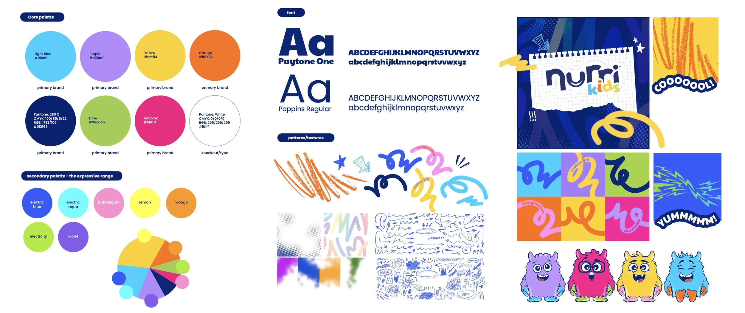
Brand Elements Explained
Brand Design
Building a brand identity for kids isn’t the same as making something look fun. Anyone can make something loud and colorful. The harder job is making something that feels trustworthy to a parent at 7am and genuinely exciting to a six-year-old at the same time. Every decision in this system from the typeface, the color palette to the textures and patterns was made with both parent and kid in mind.
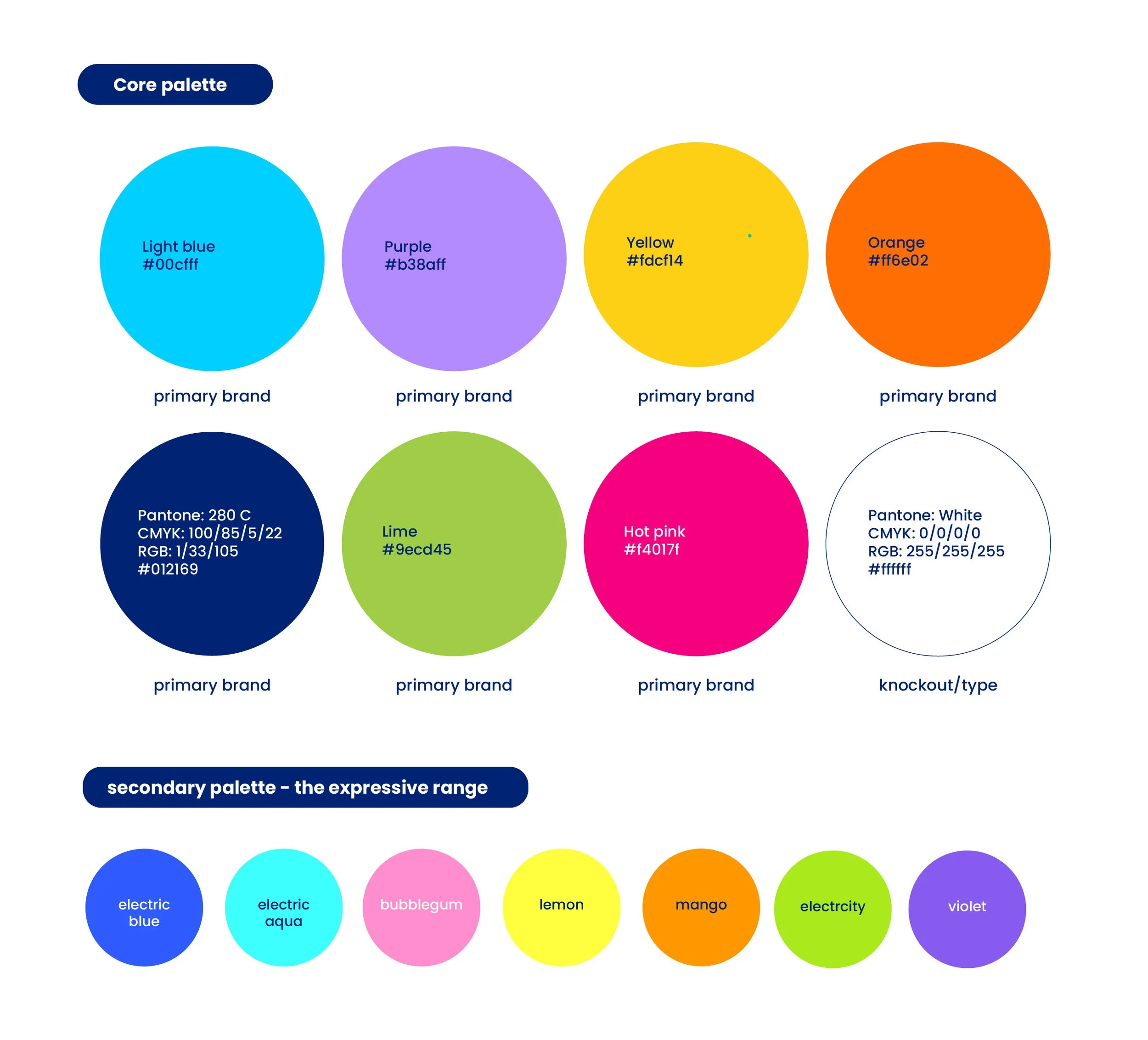
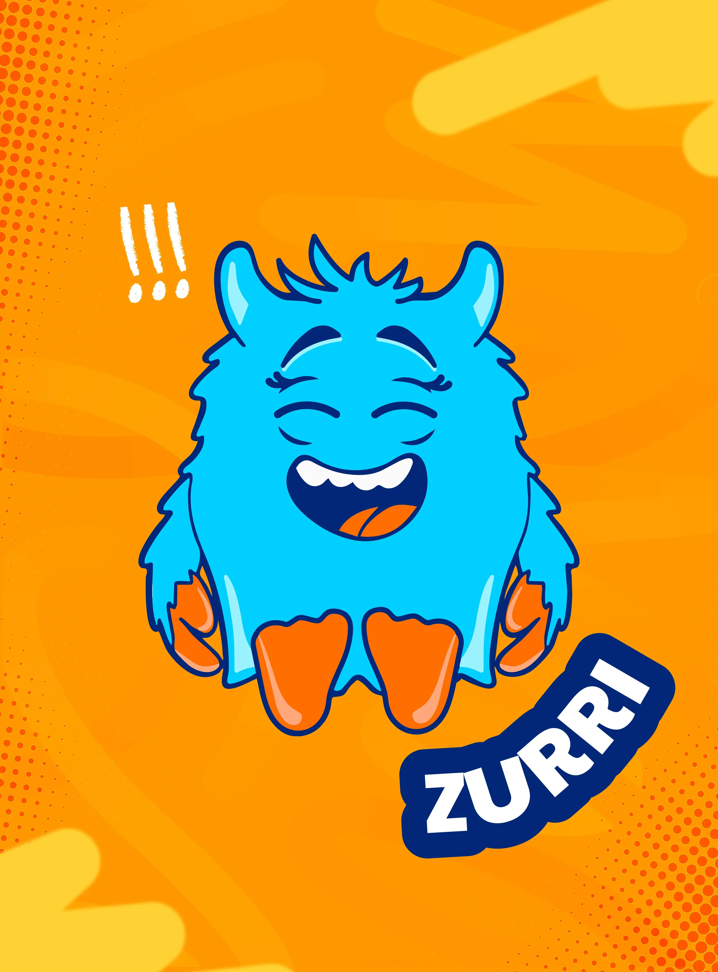
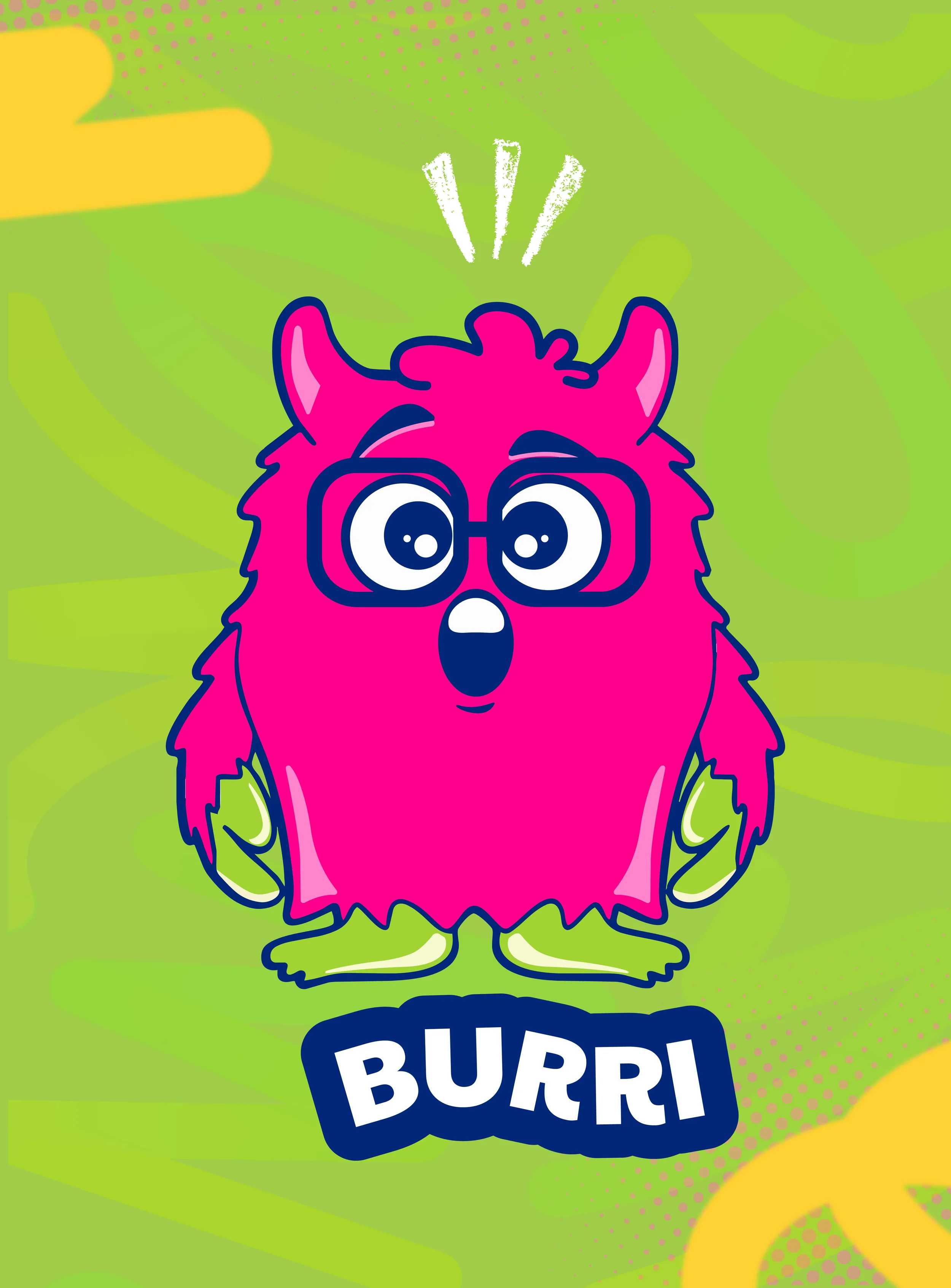
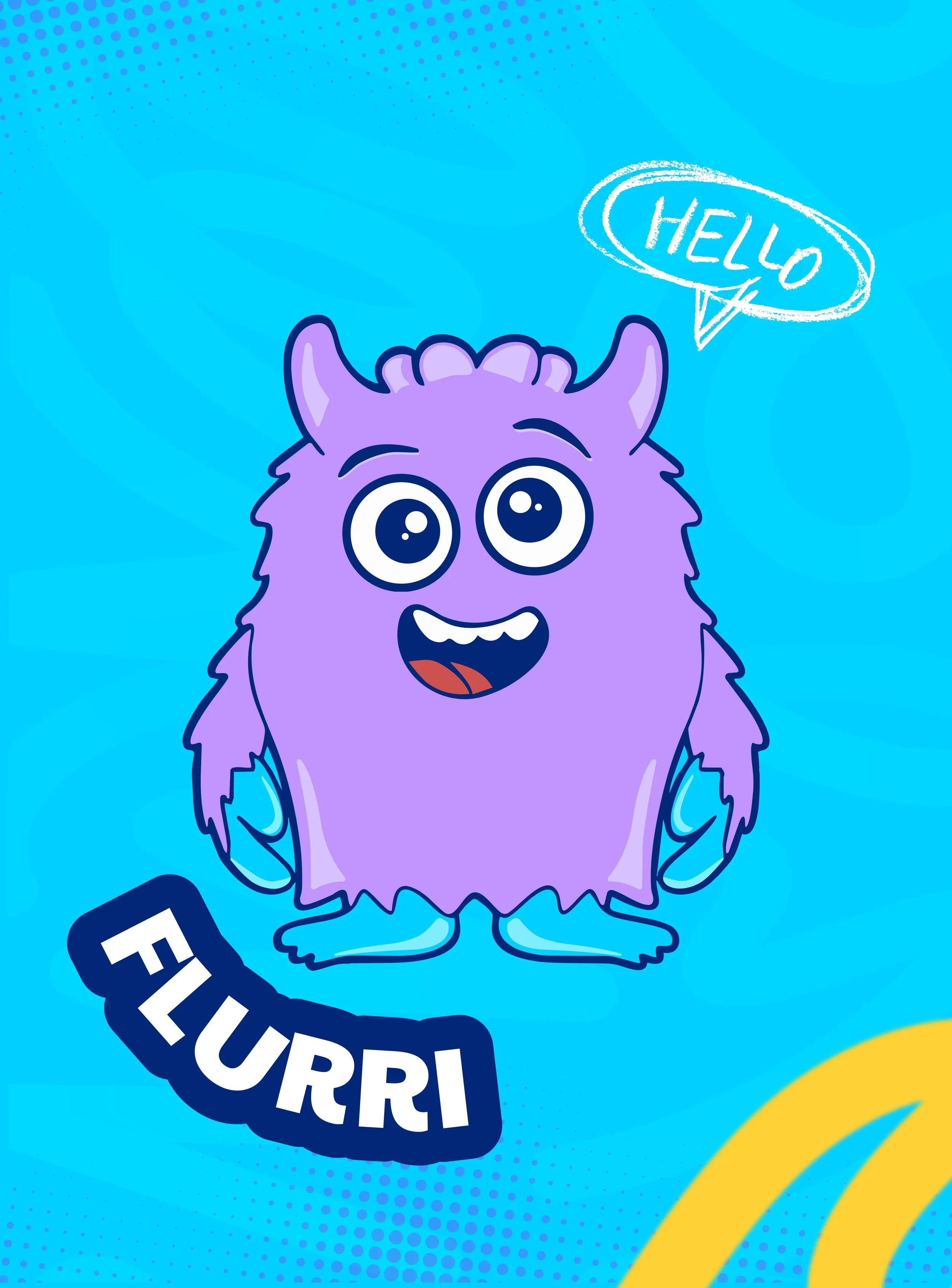
The color palette pulls warm and saturated while still being energetic enough to catch a kid’s eye and grounded enough that a parent doesn’t second guess it. This palette is doing two jobs at once by pulling warm primaries anchored by a navy base tone. Each flavor has its own color territory which does something important for the brand long term: it gives each Nurrd character a home color, so as the line grows, new flavors and new characters can join the system without needing a rebuild from scratch.
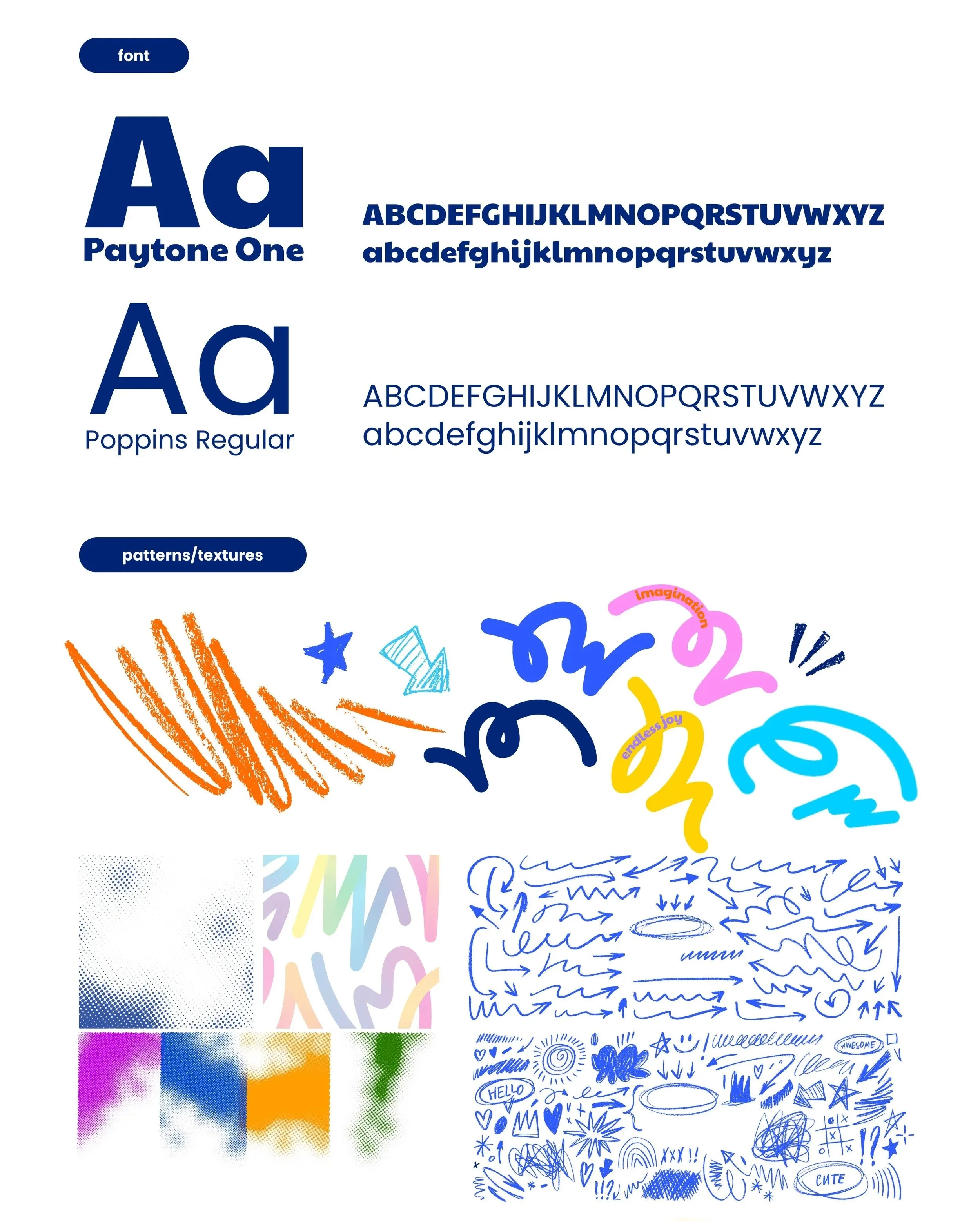
Typography for a kids brand tends to go one of two ways: bubbly and soft to the point of feeling babyish, or bold and blocky in a way that reads more like a toy aisle than. a nutrition product. We needed something in between playful but bold. Paytone One does that job. at large sizes it has enough personality to feel like part of the brand world. At small sizes like nutritional callouts, ingredient lists, the fine print parents actually read, Poppins Regular is used.
Texture was one of the earlier decisions in the system and one of the ones I feel strongest about. A scribbled, sketchy texture gives the colors and type fields depth and warmth. Without it, the identity risks being too clean and crafted which pulls away from the reality of childhood. It gives the brand a handmade quality that connects back to the illustration work throughout the system. It’s subtle enough that most people won’t consciously notice it, but they’ll feel the difference.
The pattern system was built to work across formats we hadn’t full designed yet. Relating back to the scribble textured, we designed an abstract background derived from the outlines of The Nurrds characters. This pattern has been used across packaging and the digital formats. We kept the repeat of swooshes and swirls tight enough to read as a background pattern from a distance but detailed enough to reward a closer work. From this pattern, we then created separate swooshes and swirls to use as add on textures to assets like e-commerce listings, social posts and display ads.
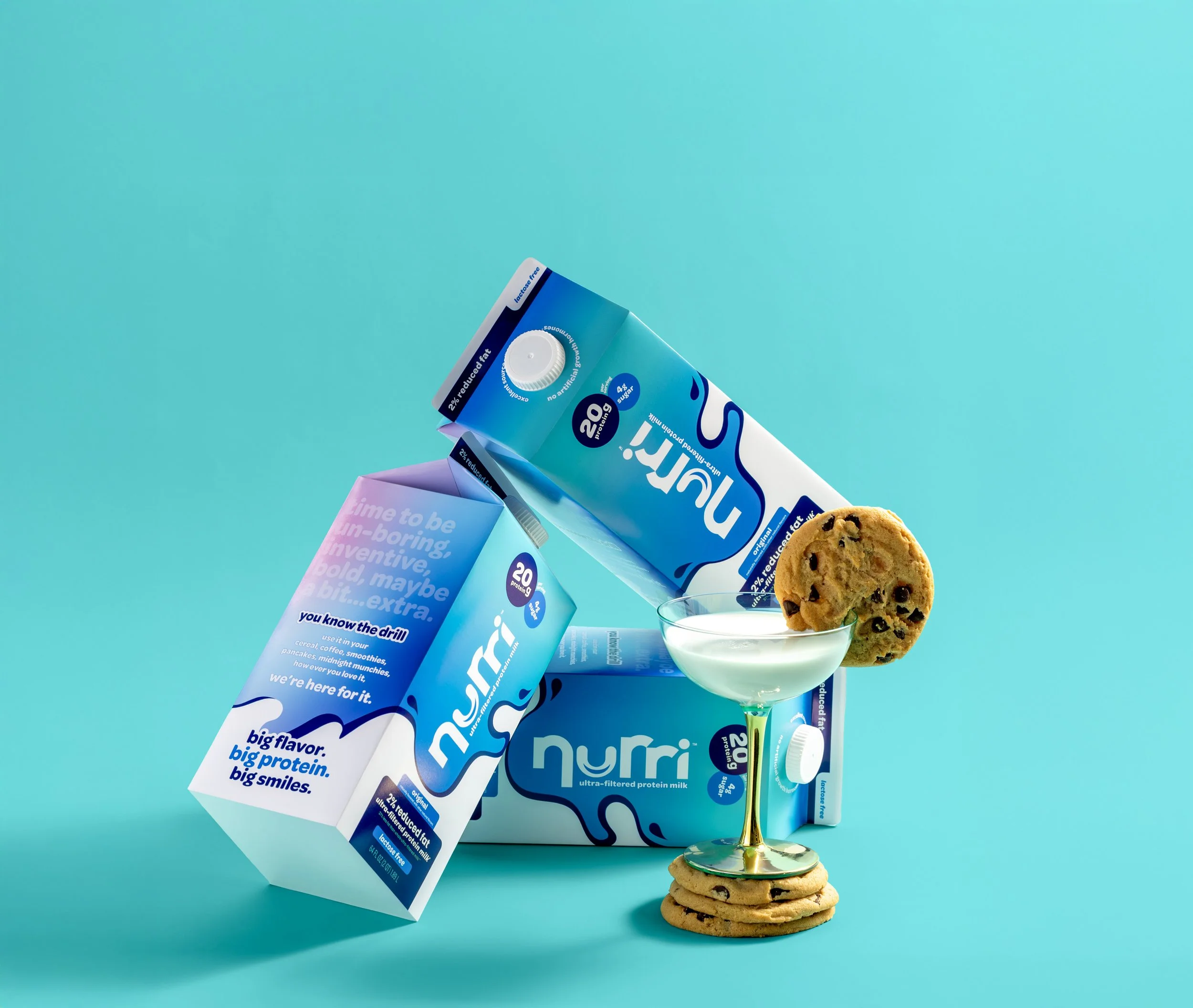
Packaging Design
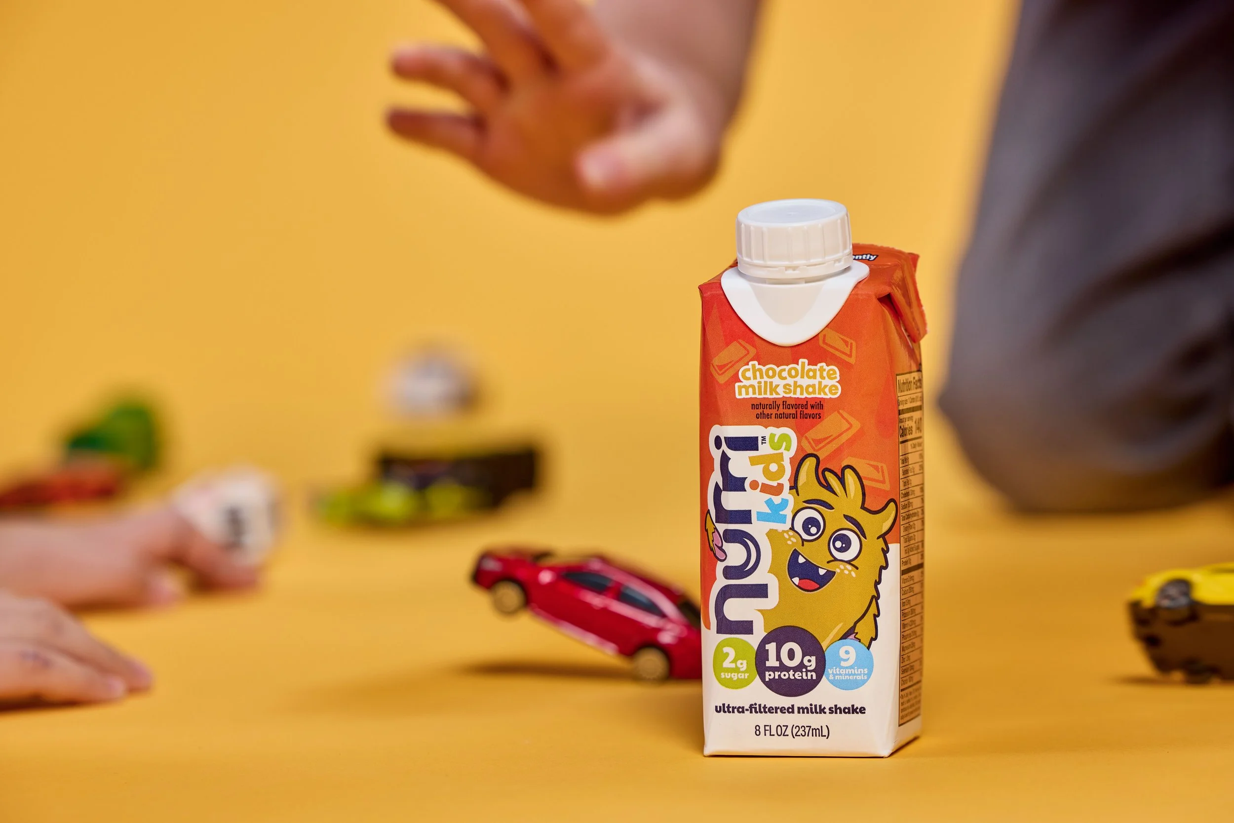
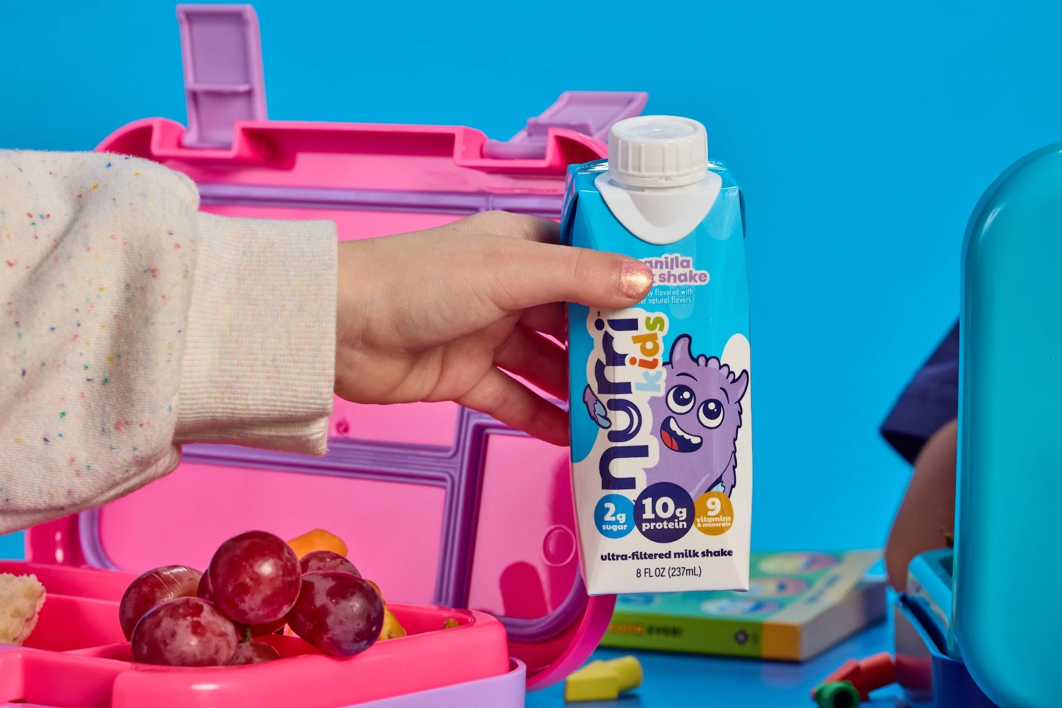
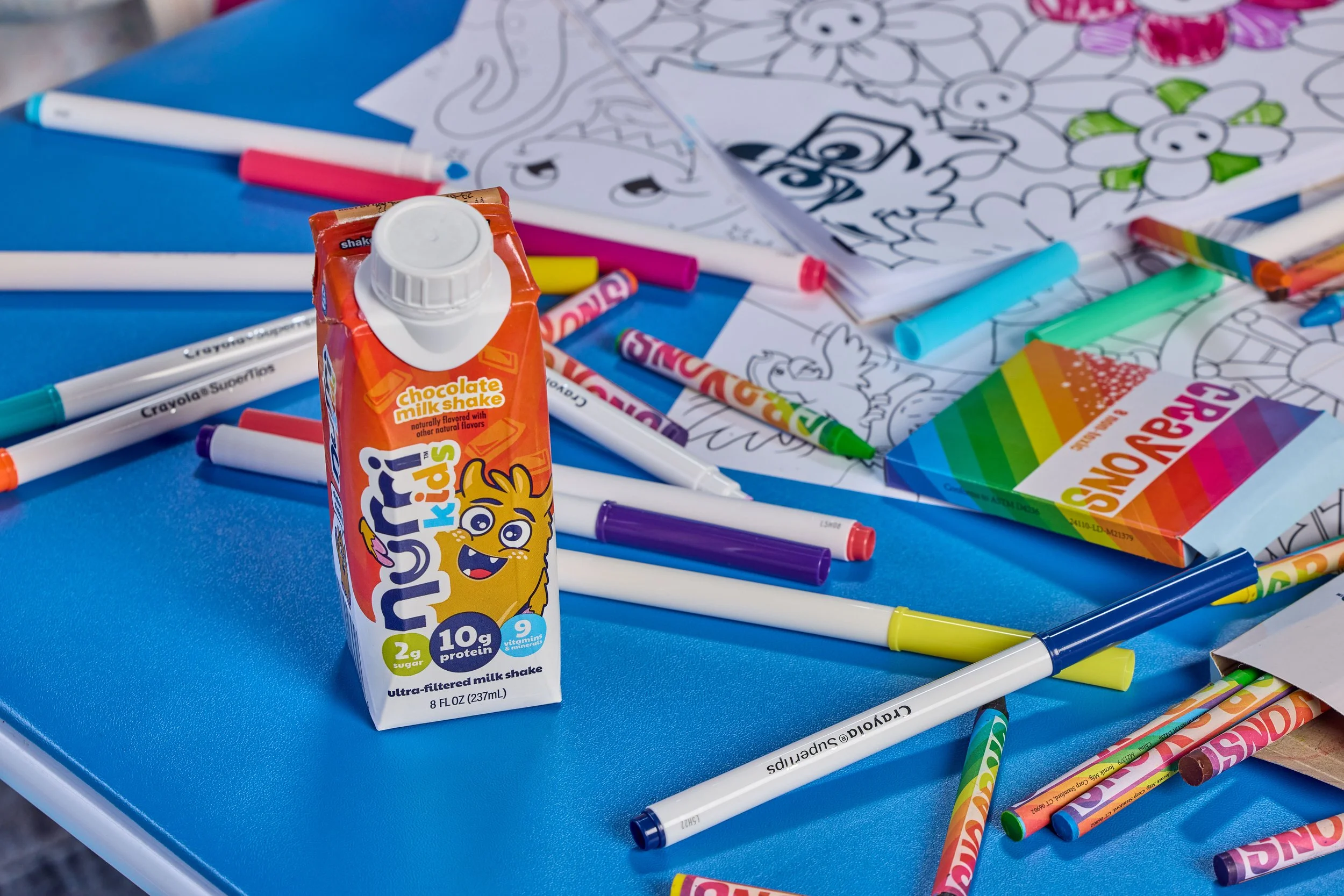
Every great kids brand has a character kids want to come back to, think Tony the Tiger’s competitive energy or the way Bluey feels relatable for both parents and kids. We needed something that could hold both: the nostalgic warmth parents recognize and the genuine relatability kids respond to.
That’s how The Nurrds were born. Each character has their own name, flavor personality, and attitude because kids don’t pick a drink, they pick a favorite. Building individual personalities into the characters gave the brand a way to grow: new flavors, new characters, new reasons to reach for the shelf.
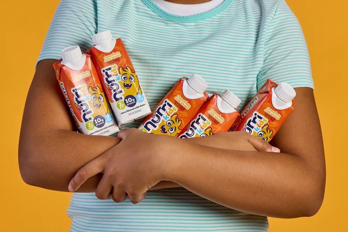
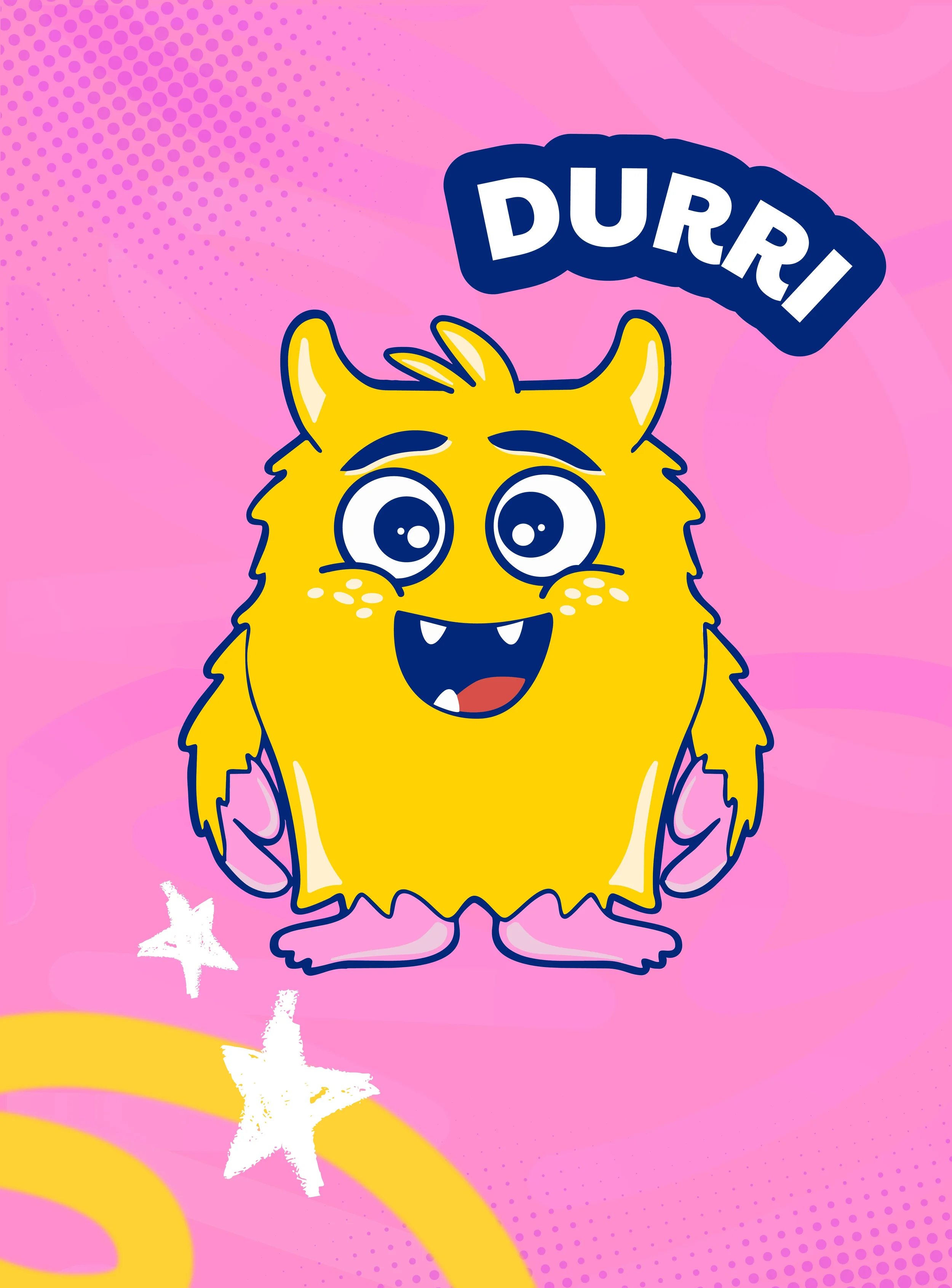
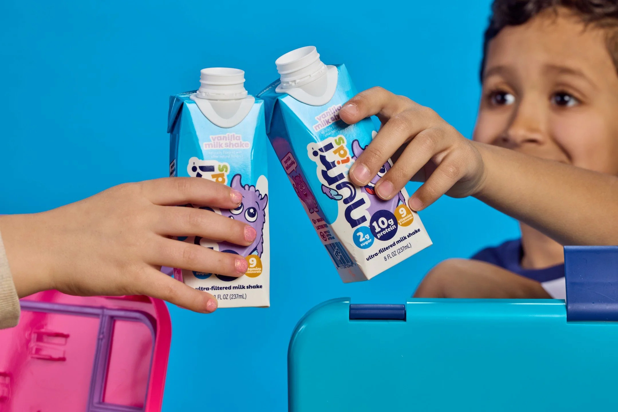
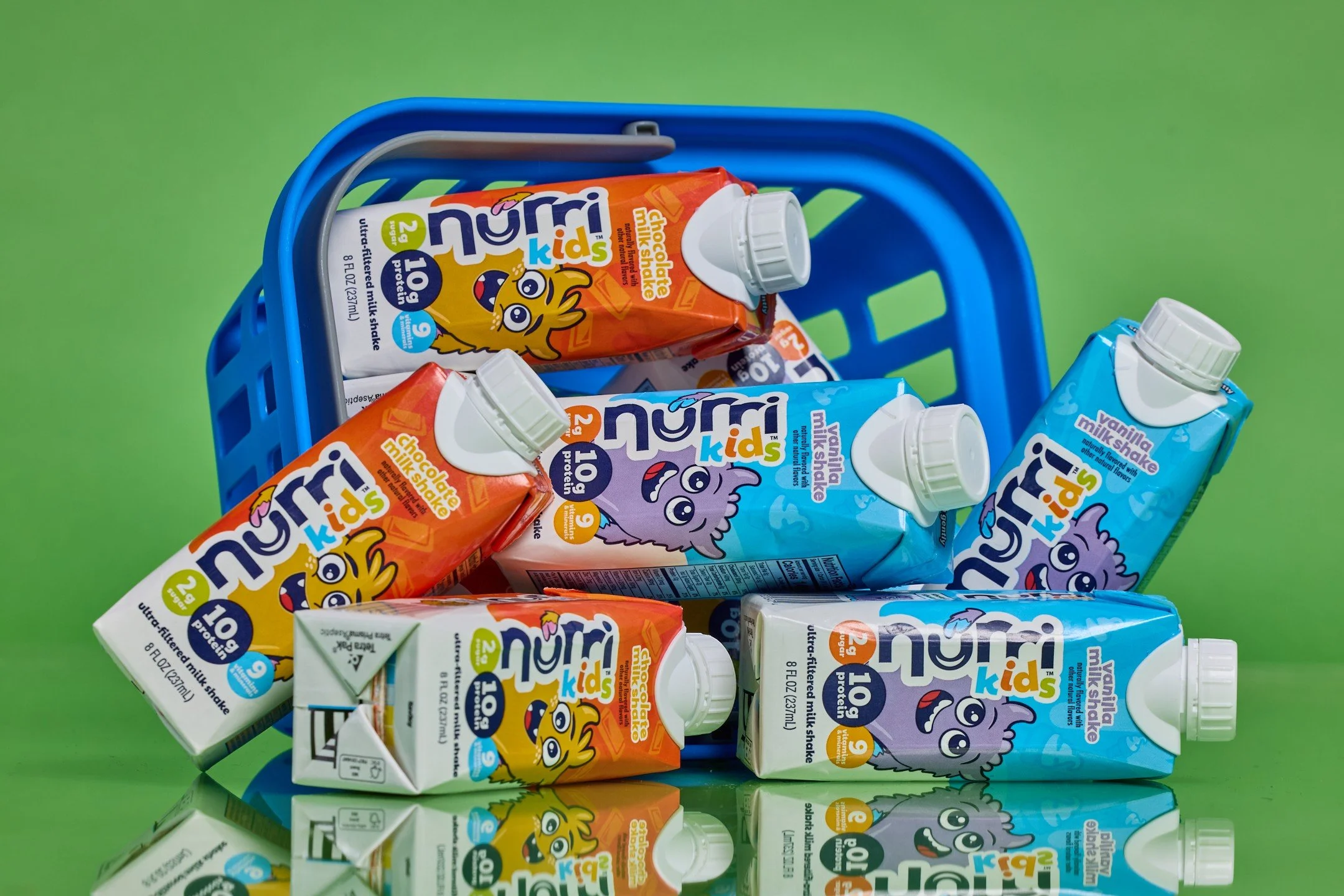
Character Design
Nurri started as an ultra-filtered milk shake with a bold refresh problem: stand out in a saturated functional beverage category without losing the approachable, playful personality that makes the brand different. What began as a packaging and campaign refresh has grown into a full brand system, now spanning protein milk shakes, creamer, milk, sparkling protein water. Each new product line is a new design challenge: how do you stretch a brand without breaking it?
Client work
Nurri
Overview
The Team
Caitlyn Wacholz, Graphic Designer & Art Direction
Jamie Boucher, Creative Director
Mar Novak, Copywriter & Content Creator
Brand Design
Before we could grow the brand into new categories, we needed to make sure the foundation was solid. Here’s the system that we built and how it flexes across products and channels.
Growing the Brand
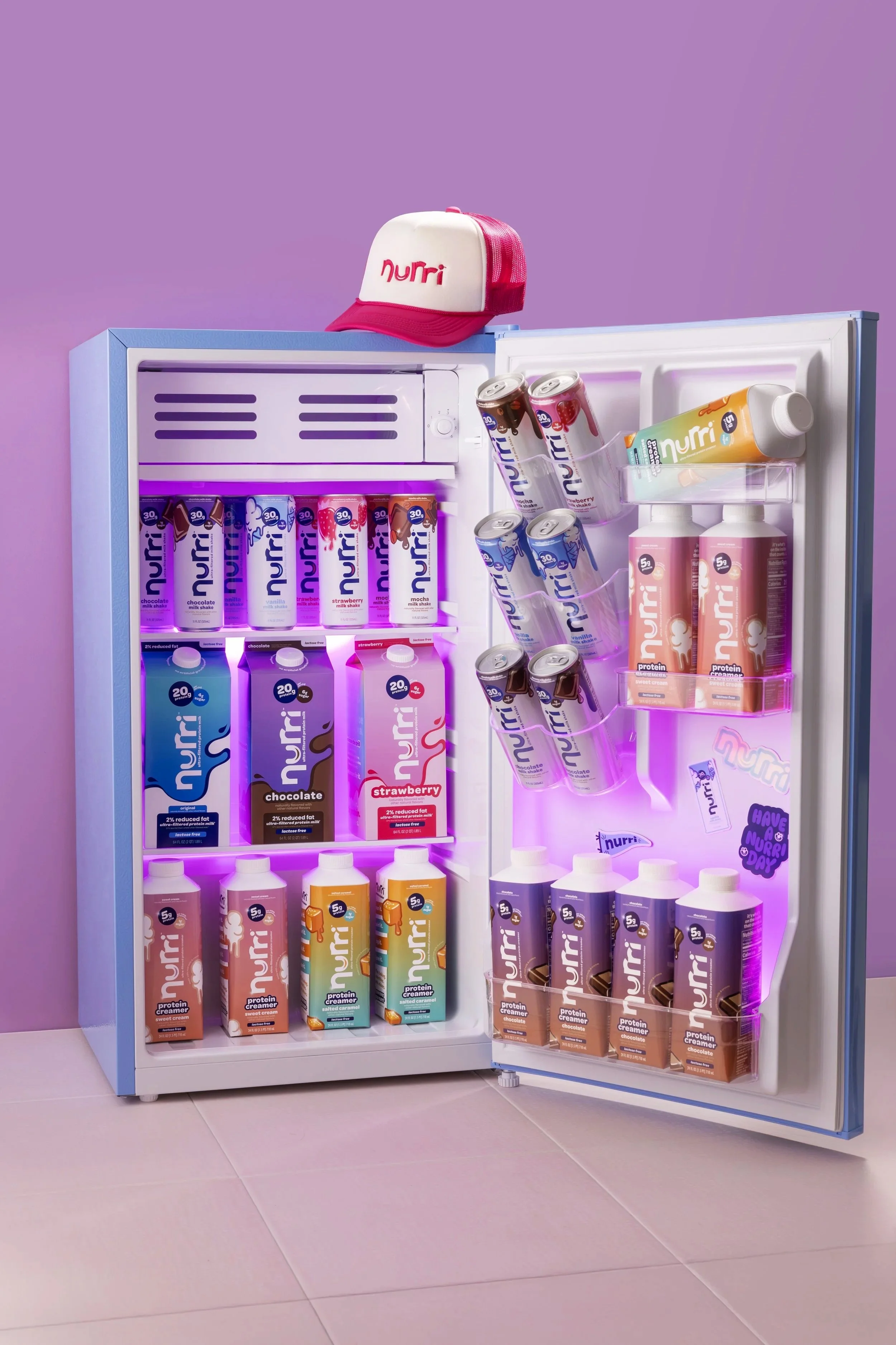
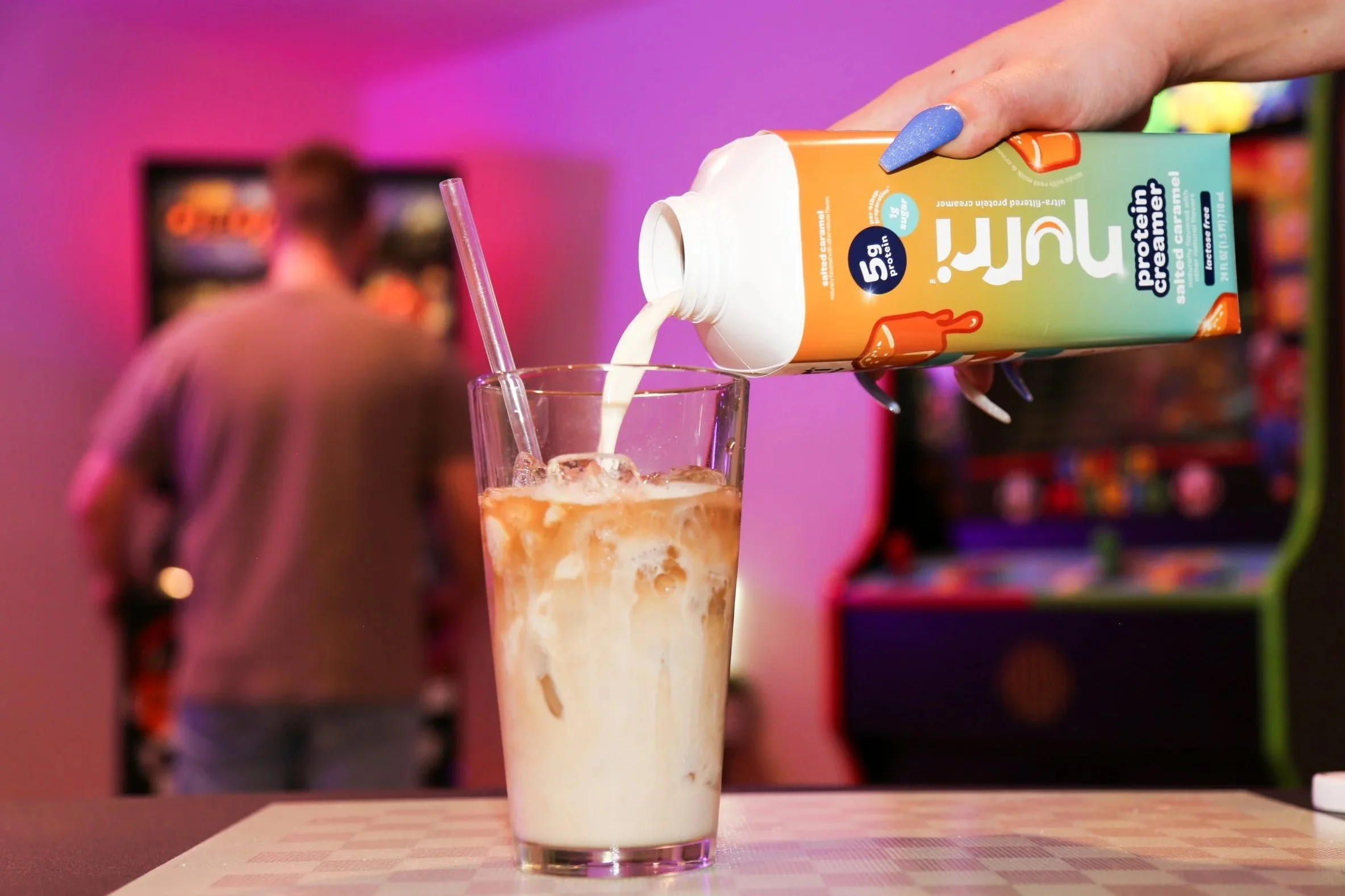
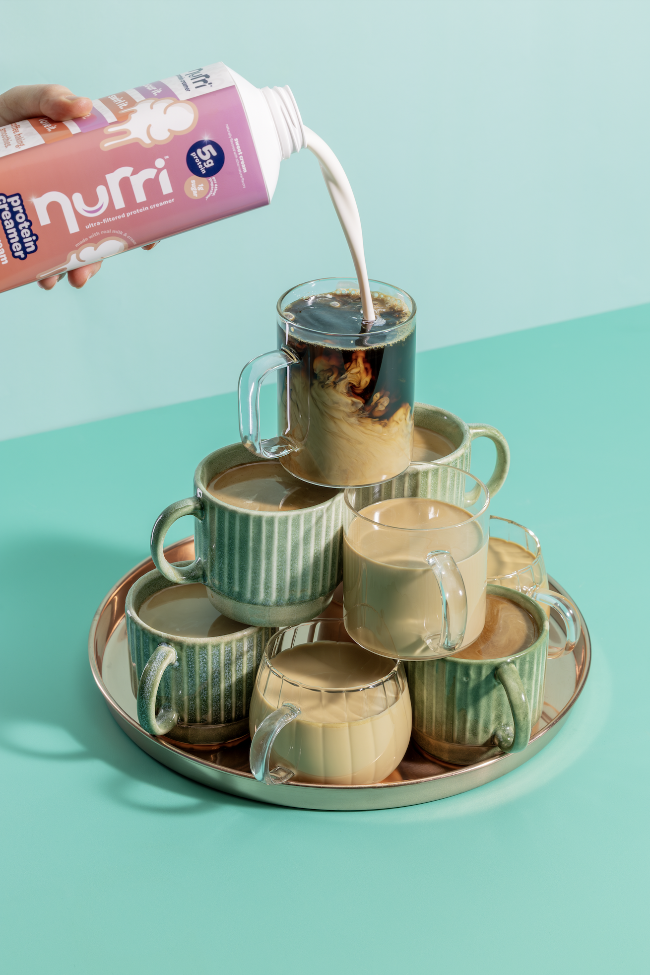
Since the original launch, Nurri has expanded into creamer, milk, a kids line, sparkling protein water. Each new product is a new problem, a different aisle, a different consumer, a different format, but the same brand. Building a system flexible enough to handle that growth without losing its personality is the work I’m most proud of here.
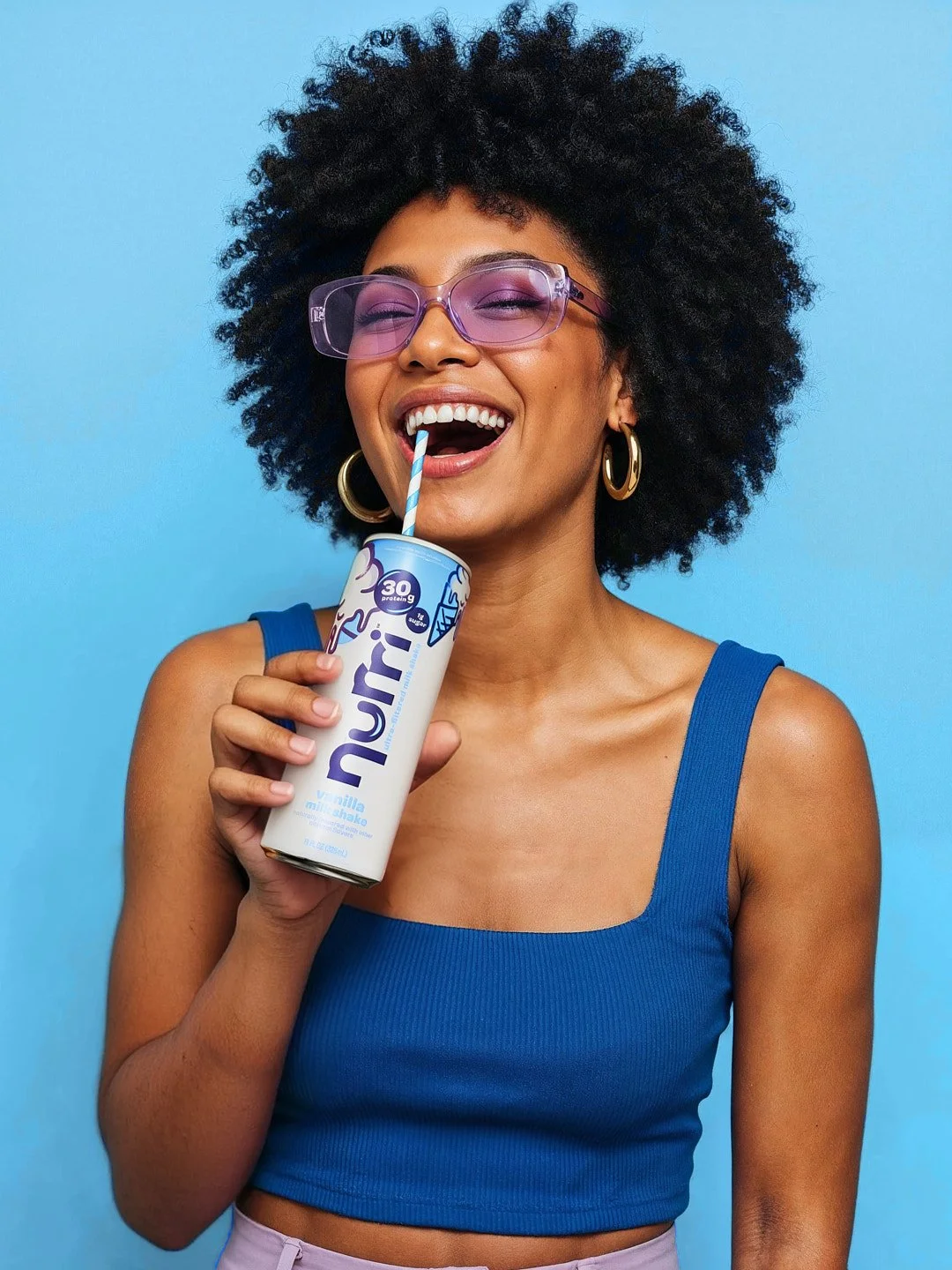
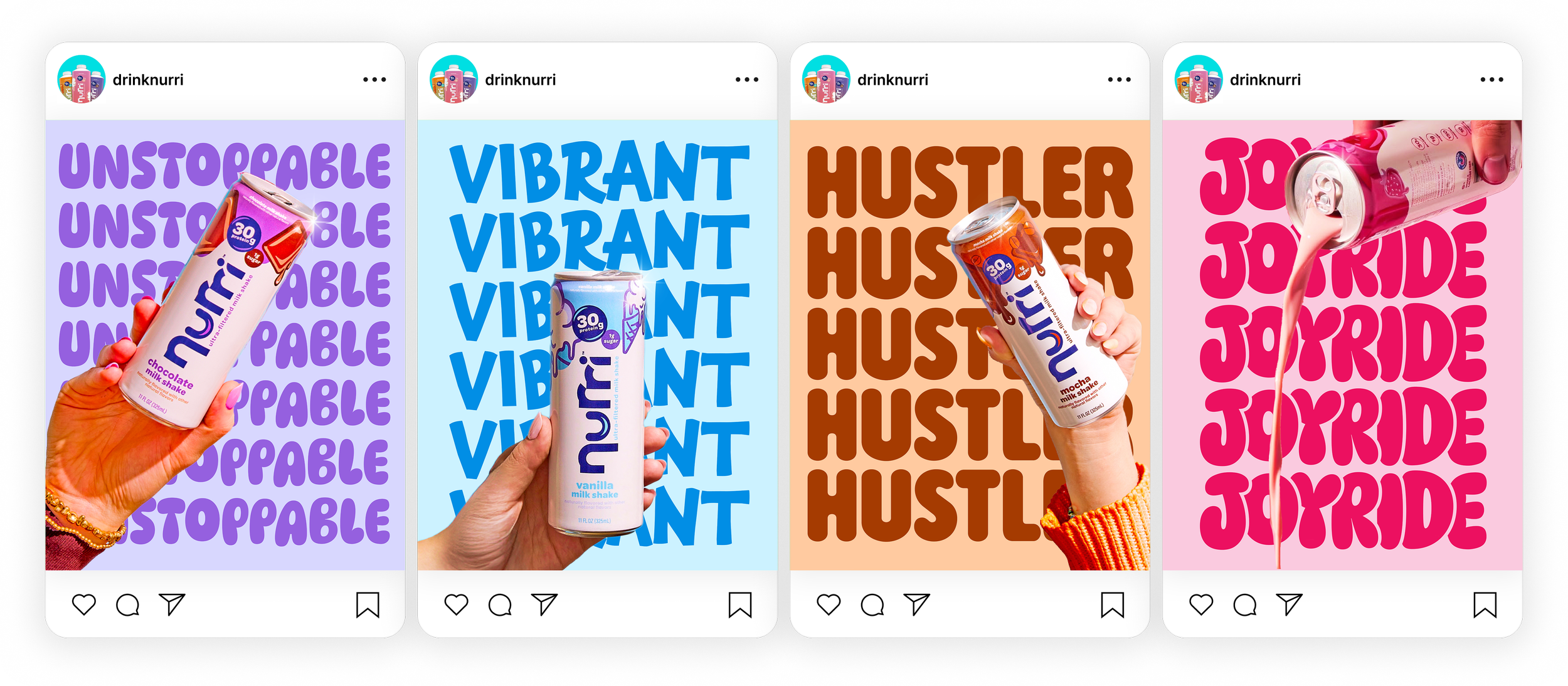
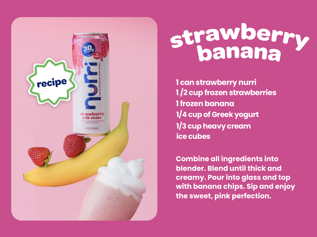
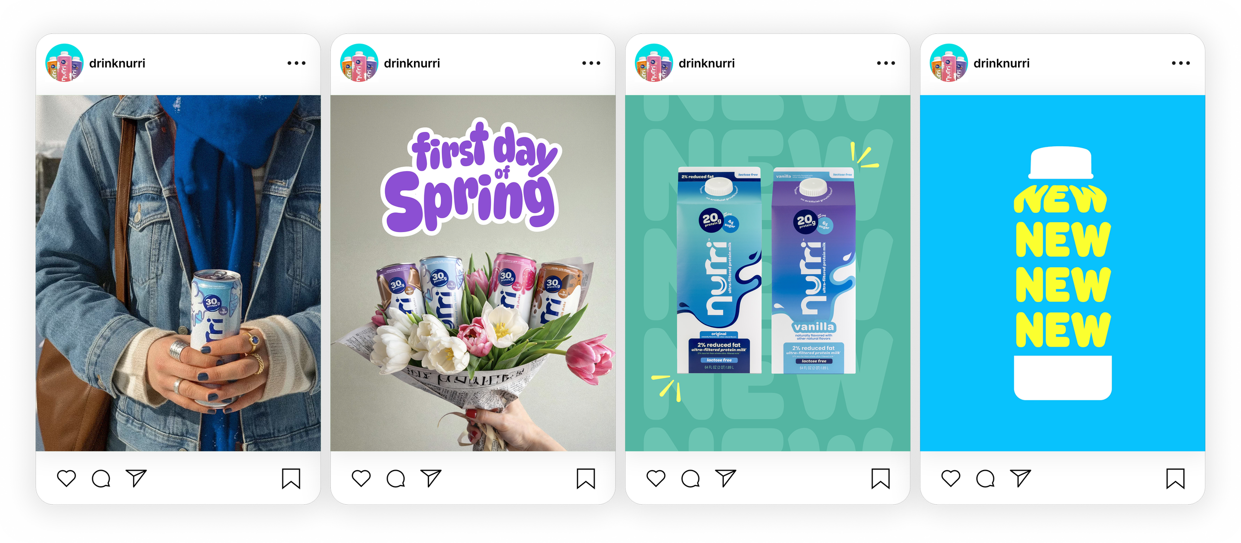
Consumer Social

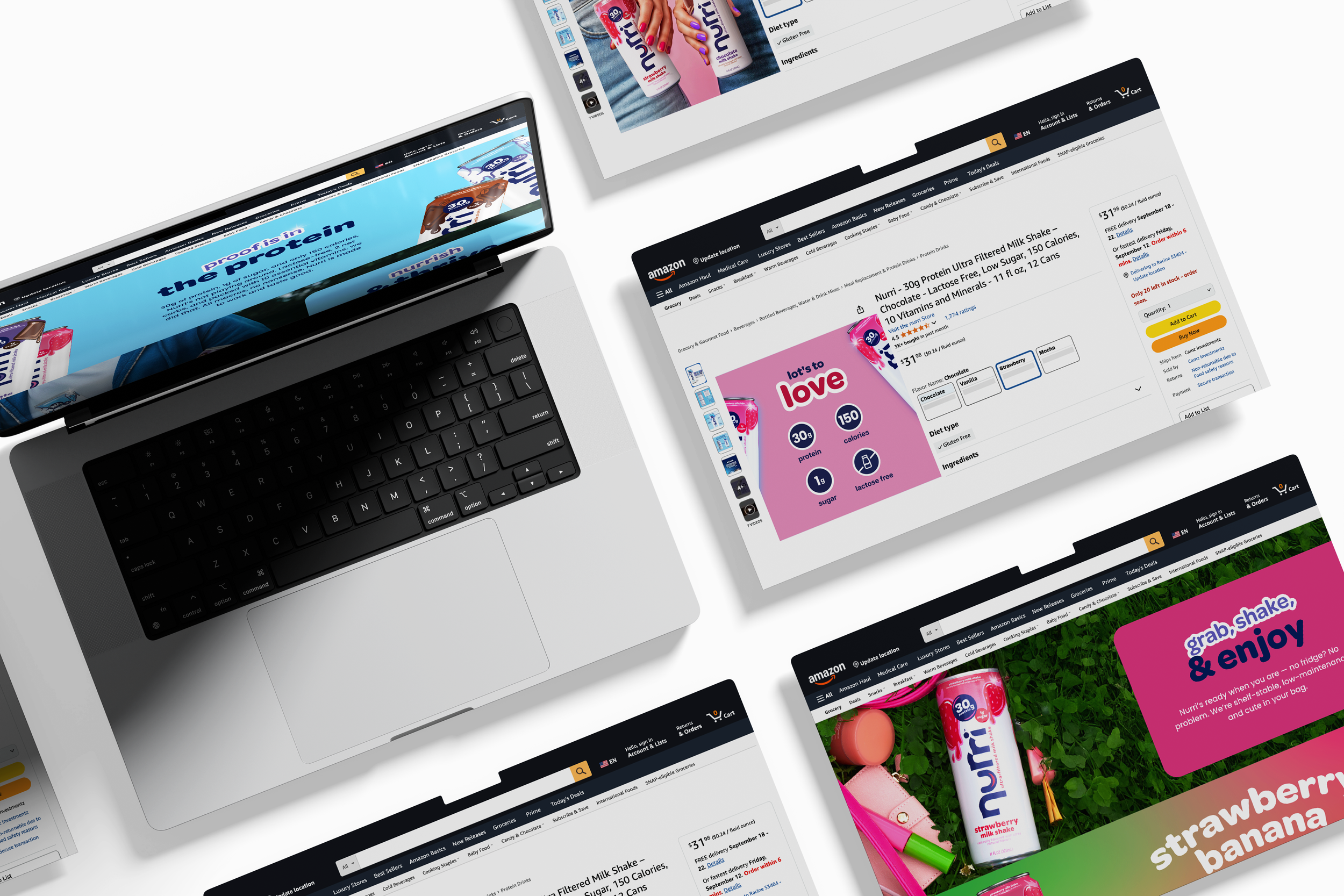
Ecommerce